For New Car Liveries, Image Is Everything

Amidst the ongoing search for speed, some sandbagging and the occasional engine controversy – one of the aspects of last week’s Spring Training at Sebring was the unveiling of many new and revised liveries for IZOD IndyCar Series teams. In the days before Spring Training and the internet, we had to hope to catch a random glimpse of what a new car might look like for the upcoming season in the various motorsports magazines. With the magic of Twitter, on-site reporters were tweeting the new paint schemes of various cars just minutes after they hit the track.
There is a popular school of thought among those that perceive themselves as true racing aficionados that says they don’t care what the new cars look like so long as they are safe and they provide good racing. While I’ll agree with that the cars should certainly be safe and race well, I’ll disagree with the notion that looks aren’t important.
Being the shallow and superficial man that I am, I place a great importance on looks – which probably explains why I’m still single after being divorced for over fifteen years. I follow the theory that “image is everything”. We’ve all read and heard the various opinions of the new DW12. Some consider it hideous while others are warming up to it. Personally, I actually like it from the cockpit forward. I think the front-end looks updated and modern compared to its predecessor. I’ll admit to being disappointed when I saw the car would continue the air box, although the engine is no longer naturally aspirated. But since IndyCars have had the air box since 1997 and Formula One cars even longer – I can certainly live with it.
My only serious complaint about the car is the bulbous growth on each sidepod just ahead of the rear wheels. Is it a safety issue to prevent wheels from inter-locking? Is it an aerodynamic device to help streamline the rear wheels? Does it do both? Whatever the case, it sure is ugly. But one thing is certain – it’s not going away, not this year anyway.
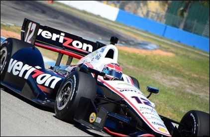
Whoever designs the liveries for the cars had an added challenge this year. Not only did they have to design around an entirely new car, they had to do something to work around the giant sidepod bulge. Some teams utilized the additional space for a sponsor’s logo. Others unintentionally accentuated the ugliness by painting it in a light color or writing the sponsor’s name up into the bulge. Team Penske did the best job of downplaying the giant fairing. They utilized dark colors and chose to display the sponsor name horizontally and completely ignoring the added space.
(All photos courtesy of Trackside Online)
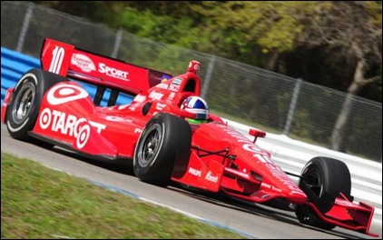
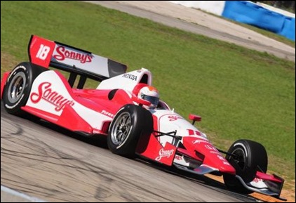
Target Chip Ganassi Racing took a different approach. They saw this as an opportunity to display a giant target on the new area, which serves to draw your eyes immediately to the enlarged bulge. Dale Coyne racing decided to write their sponsor’s name at an angle, thinking that this would provide bigger lettering. Perhaps, but reading at an angle always makes me do more work than I really want to.
As usual, some teams did a nice job with either updating their current liveries or designing new ones; while other teams missed the mark. Then again, some of the teams were still waiting on sponsorship deals to come together. While Sarah Fisher Hartman Racing continue to pursue a deal with Walgreens, they ran their car for Josef Newgarden in a basic white and light blue scheme. Dragon Racing ran their one car in carbon fiber black – just as it came out of the crate.
Some of the liveries I liked (in no particular order) were:
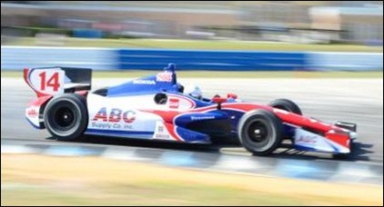
Mike Conway for AJ Foyt Racing in an updated ABC Supply scheme.
Ed Carpenter in his Fuzzy’s Vodka livery. Although you can’t tell from this photo, the white portion of the car is covered in golf ball dimples – in honor of Fuzzy’s founder, golfer Fuzzy Zoeller.
Graham Rahal went from one of the ugliest schemes on the grid last year, to one of the best looking this season, with just a few design tweaks.
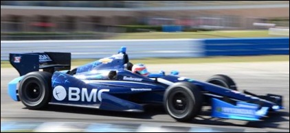
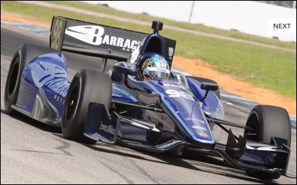
Rubens Barrichello has, by far, the best looking of the KV cars.
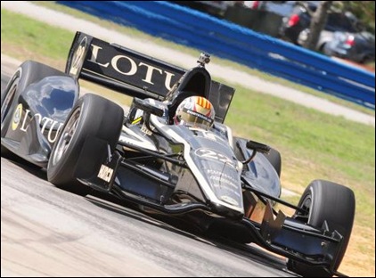
Oriol Servia has a car reminiscent of the old John Player Special from Formula One.
Alex Tagliani has one of my favorites if not THE favorite this season. I’ve seen several pictures that show the tasteful use of royal blue and black. I’ll bet this car will be striking in person.
There are some whose schemes are so similar to last year’s that they hardly merit mentioning, but I guess I will anyway. Helio Castroneves was carrying the Shell/Pennzoil livery he ran at Indianapolis last year. It’s not one of my favorites, especially considering they have seemingly passed on the opportunity to run a retro paint scheme harkening back to the Rick Mears design of the eighties. Ryan Hunter-Reay and the Go-Daddy car of James Hinchcliffe have made only subtle changes to their last year’s scheme.
Some of the cars that completely blew it, in my modest opinion are:
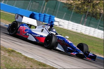
Marco Andretti carries new sponsorship with RC Cola. Unless this design came straight from RC, this is no way to welcome a new sponsor. The “RC” letters are big and easy to read, but from a purely aesthetic standpoint – they make the already large bulb on the sidepods look huge.
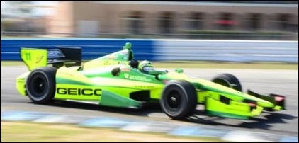
Tony Kanaan has already had his paint scheme modified since we first saw it at a test in Texas a couple of weeks ago. They have toned down the almost-all bright day-glo green with a more liberal use of dark green. If they wanted to incorporate even more dark green into the livery, it would suit me just fine.
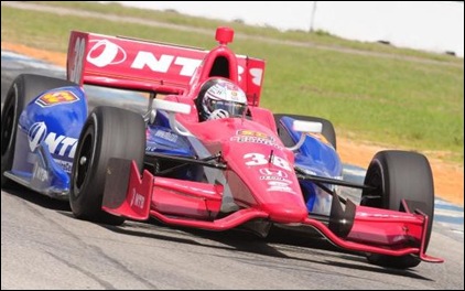
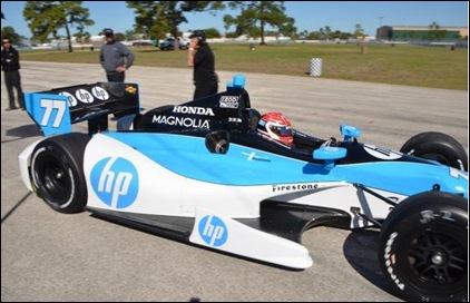
Simon Pagenaud is running a new scheme for HP, who has never been known for good-looking liveries. They continue that tradition in a new car for the newly renamed Schmidt-Hamilton Motorsports. Like Marco’s car, the “HP” letters are gigantic and highlight the ugly sidepod bulge. The white and bright light-blue on the bulge doesn’t help either. Dark colors look much better in this area.
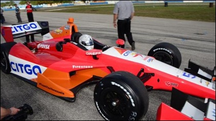
EJ Viso is running Milka Duno’s old Citgo colors. One of the few things that Milka actually had going for her was a decent looking car. Somehow, KV has managed to turn that basic scheme into an ugly car. Hopefully, the crash-prone Viso will have better luck than Milka did.
Overall, I think that the teams have done a good job in making a somewhat unattractive car look pretty good. There were far more hits than misses. They can’t all be nice looking. But judge for yourself when the green flag drops in less than two weeks in St. Petersburg. These opinions are, in fact, coming from a very shallow and superficial perspective. So take it from a guy who takes everything at face-value. In my materialistic view, image is everything.
George Phillips



March 12, 2012 at 3:25 am
I love dark blue, and I like black – in many contexts.
And I like the Lotus D&RR car Oriol’s driving and Barrichello’s. Tag’s has the huge fish head up the flare, drawing our eyes to the fairing, so no vote from me although it’s blue and black.
The HP car could be DARK blue (a receding color), black in zones we don’t need to look at, with silver or white accent stripes or a silver background for an associate sponsor.
March 12, 2012 at 7:18 am
I didn’t see where to vote for any of the Penske cars so I checked “other.”
March 12, 2012 at 7:18 am
By the way, I like the new car. A lot!
March 12, 2012 at 7:25 am
I guess that since Milka isn’t driving in the series no one will complain any further about Citgo’s Venezualan origins. That is just my guess. 😉
March 12, 2012 at 7:45 am
PDVSA/Citgo is one sponsor I’d love to see gone actually, but since they (Venezuelan govt owned oil) sell to the ever-oil-hungry USofA to support their dictatorial regime, and not market tobacco, I guess they’re still OK (?)
March 12, 2012 at 7:35 am
I actually don’t mind the rear bulges and in my view they don’t need to be ‘minimized’. The use of that area is fine w me. I think the HP and RC logos do a nice job of that as opposed to the lines cutting horizontally through it like the Citgo car. Love ya TK, but that Geico car is fuuuugly.
The part of the car I dislike most is the little fin that extends vertically from the extended floor tray, in front of the sidepod. I’m sure there’s a very good reason it’s there, but that’s the most out-of-place bit on the whole chassis to me.
In all, if we’re debating the whys and wherefores of livery design, I guess that signals there’s not much left to complain about at this point. Bring on St. Pete!
March 12, 2012 at 7:38 am
George,
I notice you left off Helio’s Shell/Pennzoil car. UGH! Looks like a clown car with all the red and yellow. 😦
Now, I are not an engineer, but I can spell the word and can figger out what some of these aero-mo-nautical appendages are for. My guess would be the “bulbous” appendages are “kick-ups” that direct the airflow over the tires and toward the rear wings. I would also guess the shape is integrated with the sidepod to prevent the kick-up being torn off by an errant wheel, like what happened with the older cars. Note the edge of the kick-up is even with the rear wheel to prevent cars interlocking wheels while racing.
Now note all I’ve typed about the rear kick-up and see that the cars run the F1 style “barge-board” near the front of the sidepod. My guess is those will be torn off at a good clip on some of these road course – street course races.
My personal vote for best looking: Will Power’s car (when it’s not on fire)
Worst? Tony Kanaan’s or the Go-Daddy car.
March 12, 2012 at 7:48 am
Artistic appeal is always about making an appeal to the subconscious emotional extreme in people and since people are different what that is can vary greatly. Being Vanilla never creates affection in the eye of the beholder. Rarely is appeal universal, with many “Great” things there are often as many who truly hate an artistic expression as love it. Where I am going with this is that I think you are going to find as many (if not more) who LOVE the RC and HP designs as those who hate them….
March 12, 2012 at 8:06 am
While Power’s car does a good job minimizing the appearance of the sidepod kick-ups, I’ve got to say that I thought that Ryan Hunter-Reay’s car does as good of a job if not a better one. Painting the top parts of the kick-ups the same color as the cowling behind them works wonders in minimizing their appearance, from the side at least. Viso’s car does this as well, and it works well… it’s other parts of the paint job that don’t work so well.
The RC Cola car looks great too, but I’m very biased here and think all RC Cola race cars do… Even Stacy Compton’s NASCAR truck. I assume that Andretti is anticipating selling the white space on the car.
The only paint scheme that I have seen so far that I would consider fairly unattractive is Simona’s (Dragon doesn’t count). Much as I love green, the transition between the BRG and Gold from the nose to the “bubbles” in the middle of the car is abrupt and awkward.
March 12, 2012 at 8:15 am
The new look of the cars is ridiculous to complain about. The people who look and judge make me laugh because it shows how uninformed they really are. The car design is a funtional one, air box and side and rear intrusion areas. The people who complain are the same people who wash their cars but never change the oil in them. The cars are funtionable designs and fans should get over the idea it should be this or that.
March 12, 2012 at 9:21 am
I think comparing people who complain about the looks of a race car to people who did not buy the Eagle Premier is more fair than the car wash/oil change parallel.
March 12, 2012 at 10:59 am
Sounds to me like you’re one of the racing snobs that George was referring to. It’s one thing to be a purist. It’s another to settle for watching a butt-ugly car so long as it’s functional. It think George was carrying his point about being so superficial to the extreme just to illustrate his point; which was that cars can be both beautiful and racy at the same time. Lighten up and get over yourself.
March 12, 2012 at 11:54 am
Get over myself is a lame way to illustrate your opinion. I have worked as a mechanic on open wheel cars and I can say a fast and safe car is the direction. My point is the car is here for one year and by this time next year we will all have something new to view. Complaining does nothing to help the series. Ugliness is an opinion and I think the cars look good.
March 12, 2012 at 8:36 am
I like Ruben’s and Servia’s cars best. I’d like to see someone go with an all gloss batmobilely-black. I basically agree that the big bump should be ignored, but on the other hand I like that the HP car shows the curving side and doesn’t try to hide what it is…
Hey George, if Sarah gets Walgreens on her car, will CVS immediately sponsor the car next to it?
March 12, 2012 at 9:03 am
All right! A festival of shallow and superficial today. I am going to go with the vintage John Player look of the Lotus. I always liked those. I like the Sonny’s car. Easy to identify coming around the track. Worst looking? Day-glo green just doesn’t make it Tony. Trying to blend orange and red on the Citgo car doesn’t float my boat either. On the other hand, a bright red with just a hint of orange in it is a good racing color. I also liked the medium blue wiht red accents in the old Blue Crown and Dowgard Specials. One of my favorites back in the day was a midget with a black/blue livery that looked much like the colors that new exhaust pipes turn when they are heated up. Under the lights it was awesome.
I am going to part company with Steve who appears to be looking down his nose at us this morning. I believe it is possible to combine form with function with no loss to function. Just about any Ferrari will confirm that.
March 12, 2012 at 9:22 am
The New Dallara is incredibly ugly. In contrast the new paint scheme’s are overall better than in the past so that’s something.
March 12, 2012 at 10:37 am
The cars look great coming but ugly going away. There is just too much stuff from the cockpit on back. It naturally looks off balance.
March 12, 2012 at 12:02 pm
“My only serious complaint about the car is the bulbous growth on each sidepod just ahead of the rear wheels.”
My complaint is the bulbous grown both in front of and behind the wheels. In any other situation ,they would be called fenders.
and they need to go. This is AOW racing. Keep the fenders in Nascar.
March 12, 2012 at 1:48 pm
The fenders are for safety. I assume if they work (and don’t spend their lives as debris on the track) they’ll keep them. If they don’t work, they’ll trash them. I like the car, it’s different and seems to be okay with the drivers. It’s safer, sounds better and is quicker (at least on the twisties.) I think fans new to the series will find them interesting. And if you don’t like the shape, well, (hopefully) next year we’ll have some different shapes to complain about…
March 12, 2012 at 3:34 pm
I hope that teams are allowed to cut off the bulbous fairings if they don’t offer aerodynamic benefits and they hinder tire-changers’ work.
For decades IndyCar designers and aerodynamicists in Penske, Lola, Reynard, Swift, All American Racers, Panoz/G-Force and Dallara,
and Formula One designers,
did not make open-wheel cars look like this. Seems that one guy in Dallara wanted this, and everyone has to cope with his whim.
March 13, 2012 at 8:48 am
I’m really hoping that the issue with Viso’s car is that they were changing liveries and didn’t have time to repaint the entire car prior to the test. The burnt orange sections of the car just seem out of place with the rest of the color scheme. I doubt it will still be there at St. Pete.
I’m not a fan of this car’s big ass, but I’ll take it any day over the F1 “broken nose” look.
March 13, 2012 at 1:32 pm
Liveries on the new cars = lipstick on a pig. I’m sorry I just can’t warm up to this car.
I am afraid this car, from the Malibu grand prix style side pods to the Sir Mix-a-lot back bumpers, is going to lead directly to rubbin-is-racin style driving. With the dis-respect these guys show each other now, I can only imagine, once they start leaning on each other Nascar style, that there are going to be some spectacular accidents.
May 8, 2014 at 7:24 pm
Drake
For New Car Liveries, Image Is Everything | Oilpressure