A Retro Look With a Contemporary Feel

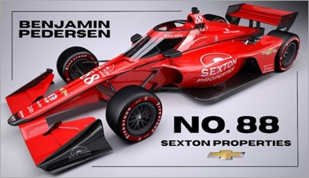
Most regular readers of this site know how much I detest change, and I usually tend to embrace anything that reminds me of times gone by. That’s why I was so happy to see that rookie Benjamin Pedersen will be sporting a livery this season. that spanned the late sixties to the late nineties.
I am in a group text with a couple of friends that is almost always IndyCar related. A week or two ago, I sent them a text asking “Have I missed something? Who is going to be Foyt’s primary sponsor this year? I don’t think Sexton Properties can foot the bill for a two-car team all season”. No one responded. Were they too busy and simply ignored the text, or did they not know and didn’t want to appear ignorant so they said nothing?
Again, I’ll say it to all of you. Have I missed a sponsor announcement for AJ Foyt Enterprises, or is Sexton Properties it?
I know very little about Sexton Properties except that they are an Indianapolis-based real estate development company. What I do know is that they have been an associate sponsor for the Foyt team for a few years now. But what IndyCar fans should remember about them is that they stepped up last season, after ROKiT defaulted on their sponsorship agreement about a third of the way through last season.
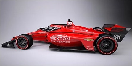
From what we learned late last week, Sexton Properties will apparently be the primary sponsor for the second car at Foyt this season – the No. 88 to be driven by Pedersen. The livery is to be Coyote Orange with black accents, very reminiscent of the cars that AJ Foyt drove to two of his four victories, in 1967 and 1977. I think the logic behind the numbering is a little odd. They are going with No. 88, to recognize that AJ Foyt is now 88 year-old. If that’s the case, why wasn’t Dalton Kellett in the No. 87 last season?
I am letting my imagination take over a little bit, as I am hopefully assuming that the No. 14 of Santino Ferrucci will carry the opposite livery – black with Coyote Orange accents – similar to what Foyt drove in his last few years, when he carried Copenhagen sponsorship.
This would give Foyt fans two different eras to draw from as they remember the days when Foyt was a favorite to many.
I noticed the press release last week referred to the color of Pedersen’s car as Coyote Red. I always remembered this color being called Coyote Orange back in the 60s and 70s, so that is what I’m going with. Besides, if you’ve seen this color in person, it’s really hard to call it red.
If I’m being completely honest, I’ve never been a fan of that color. If it it the same color of the ‘67 and ‘77 winners, it looks different than what is pictured. Those cars looked very similar to the color of Georgia clay. When Foyt unveiled that color in 1967, after being closely associated with the more traditional white and red cars he had driven since 1961 – I was not a fan, when I saw it for the first time on Pole Day in 1967. There were many good looking paint schemes in the 1967 race, but the solid Coyote Orange car was not one of them. I always thought it was a shame, because structurally, the 1967 Coyote was a very good looking car.
It grew on me over time, since all of Foyt’s cars were solid Coyote red for the next fifteen years or so. It wasn’t until 1981, that Foyt added a broad white stripe down the side of his solid-orange clad cars. In 1982, the stripe grew wider. In 1984 the stripe disappeared, but the white numbers were trimmed in royal blue. The 1985 car was back to solid Coyote Orange with white numbers, much like it had been a decade earlier.
1986 was the big departure for Foyt. The car was still predominantly orange, but almost half of the surface was now in black. It was a good look, but longtime fans had a hard time associating that scheme with Foyt. They needed to adjust quickly, as black became more prominent over the next few years. By 1988, the car was all-black with just some Coyote Orange accents. It wasn’t until 1995, after Foyt had retied from driving, that the team started introducing more Coyote Orange to the end-plates and winglets. When the Copenhagen sponsorship ended a couple of years later, the orange/black combination disappeared from the Foyt cars in favor of sponsor logos and livery.
There were a few one-off throwback cars here and there, painted in solid Coyote Orange, but something was lost in the translation from the cars of the 60s and 70s to the IRL Dallaras. Alex Tagliani ran a third Foyt car in the 2016 Indianapolis 500 that was mostly black with orange trim, but that’s been about the only time we’ve seen a variation of the scheme we saw transition from the 60s to the 90s.
For the past two seasons, the No. 14 was presented in a very bland matte black finish with white numbers and decals to reflect the ROKiT sponsorship that ultimately fell through. In my opinion, matte finishes should never be seen on a race car. Once ROKiT was off of the car, they put in no design work for Sexton, who had come to their rescue. They kept the same ugly livery. Late in the season, I saw a tease of a glossy black car with orange trim, with Sexton Properties as the sponsor. I am hopeful that is what Ferrucci will be driving when the season kicks off in March.
I know a lot of people could not care less about liveries, paint schemes or whatever you want to call the design of the exterior of an Indy car. They also don’t care about the aesthetics of a car. All they care about is speed and race-ability. I care about those things too, but even as a little kid – I’ve paid close attention to the details of the paint job of a race car.
When my brothers returned from the 1964 Indianapolis 500, they brought me a program to the race. I could hardly read, but the back cover had a Firestone ad for the previous year’s winner – Parnelli Jones and Calhoun. I immediately fell in love with that car, and I still think it is the prettiest car in the museum today. Since then, keeping up with liveries has been a passion of mine.
Unlike some poor attempt at retro or throwback liveries, I really like the way the No. 88 Pederson car looks. It isn’t trying to look like 1967. Instead, they have designed enough black into the scheme to make it look very contemporary. If both cars look like what I hope they will, the Foyt cars could be some of the better looking cars on the grid in 2023.
George Phillips


January 23, 2023 at 8:59 am
I thought a Copenhagen tribute paint job would be more appropriate for Pedersen, since he’s from Copenhagen.
Given that Ferrucci’s sponsorship and paint job were not announced, I’m guessing there may be a little bit more to that than another Sexton car… but perhaps not. Ferrucci carried sponsorship from Palermo’s foods/Screamin’ Sicilian frozen pizza at both at Indy and in NASCAR last year, so perhaps they are still involved with him.
January 23, 2023 at 9:01 am
I like this paint scheme sometimes simple can look really good. I often wonder how much thought goes into paint schemes. Is there someone whose job it is to design the livery’s or does it just evolve depending on sponsorship.
January 23, 2023 at 10:03 am
Sexton owns and operates apartment complexes in Indy, at least from what I’ve had experience with living in a sexton ‘community’ in the 90s.
January 23, 2023 at 11:06 pm
Regarding why Foyt is using #88 this year when they didn’t use #87 last year, I’d guess it’s just because people think that #88 looks cooler, because of the repeated digits. In most cases, cars with repeated digits have generally been more frequently used in the Indy 500 than other numbers among cars that begin with the same digit: #88 has been more popular than any other number that begins with 8, #77 has been more popular than any other number that begins with 7, etc.
Now, this rule doesn’t hold all the time. #11 wasn’t allowed for many years, for some timing and scoring reason that I forget, so throw that one out. #41 has been used more often than #44, largely because Foyt used #41 often. #98 has been used more often than #99 because of the Agajanian tie-in. And #21 has been used slightly more often than #22. But even in those cases, the repeated-digit numbers come close to being the most popular. Anyway, that’s my theory.
January 26, 2023 at 2:59 pm
I’m with you on the matte finishes. The only thing a matte finish should be on is a tank. Race cars should be shiny!